
Boogert's the colour categoriser
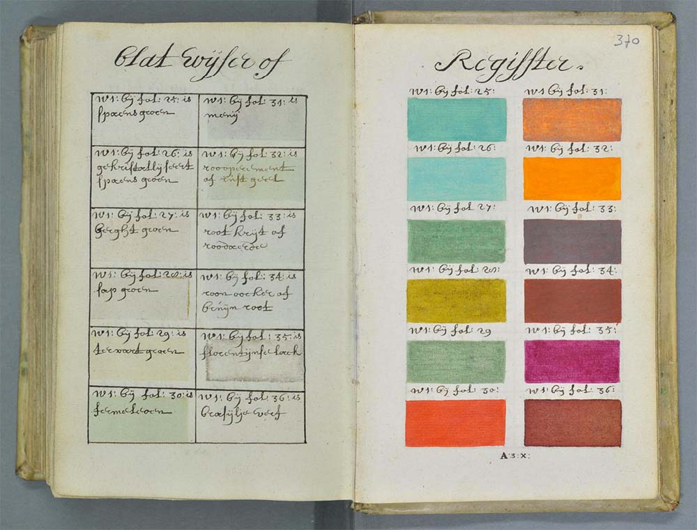
A.Boogert, a name not generally associated with screen printing in Dublin, is as relevant to t-shirt printing as much as the ink and squeegees. Boogert's is a name that should be known throughout the screenprinting world, well actually the entire art world. Aside from having an absolutely hilarious surname, Boogert’s historic footprint went relatively unnoticed until the modern day and academics have only now begun analysing his work.
His work consists of an 800 plus handwritten hand-painted document that acts as the most comprehensive paint and colour guide of its time. Colour guides remain to this day the medium that screen printers match their ink colours to and what is phenomenal about Booger (I mean Boogert’s) achievement is that his colour volumes, named “ Traité des couleurs servant à la peinture à l’eau” were completed in 1692, a whopping 270 years before the first edition of the Pantone colour guide was released.
 Pantone colour book, the birth of colour referencing
Colour - How's your perception?
Naturally, there have been other colour guides in that interim period, however, given the length of time between these publications it is stunning the level of detail and accuracy within Boogert’s guide. It was slightly unfortunate that there was only ever one copy printed and that its reach was limited, hence why it seems to have taken until only recently for it to resurface and be attributed the credit it deserves.
Although there were 300 hundred odd years between Boogert’s collection and the first edition Pantone colour book. Pantone colour books and swatches remain the go-to staple for colour matching that operates as a mutual base of understanding between client and screen printer. Unfortunately, the eye is less perceptive than the good folk at Pantone and coupled with the fact that an estimated 1 in 12 men have a form of colour blindness (Colour vision deficiency CVD), colour remains a matter of perception, and there is always room for debate on shade and tone. This coupled with an unreasonable customer and you may have problems. Luckily, for the most part, people are generally happy and the people who aren’t are most likely the type that will never be happy.
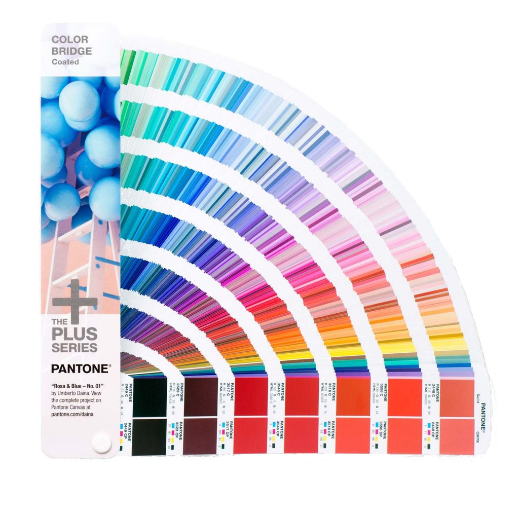 Behold, the lovely modern Pantone colour book. If Boogert's could only see it now.
What's your favourite Pantone?
Pantone colour referencing plays a large role in both printing and graphic design spheres and there are many who pay homage to the beauty and genius of the Pantone colour referencing system. So much so that it is not uncommon for industry workers to have a favourite Pantone code. So enthusiastic are Pantone fans throughout the world it has spawned a range of merchandise including Tshirts, mugs, toothbrushes, phone & tablet covers, socks, tables, chairs, rubix cubes and yes, even Christmas tree baubles. And if that doesn't satisfy your Pantone cravings then you can even stay at the Pantone hotel in Brussells. I wonder what Pantone colour my psoriasis patches are?
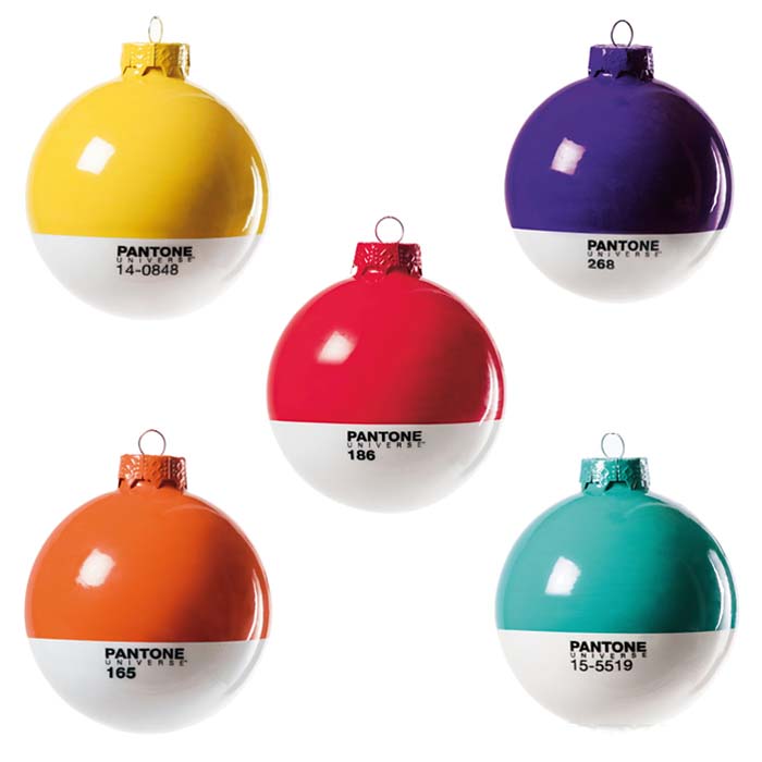 Fancy up your tree with these pantone tree baubles
So back to Boogert (I think I just like saying the name). The next time you’re matching up your colour swatch or mixing up a pot of ink, whisper a small thank you to the man who spawned the idea behind the Pantone colour guide. So what's my favourite Pantone you ask? At this time of year, there can only be one answer. Both the colour of the worlds most loved teeth rotting drink and the colour of the coat worn by the worlds most welcome annual house invader, yes, it is Pantone 'coke' red 484c.
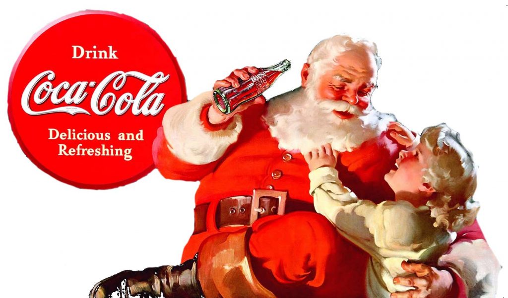 Eyes off the Coke Kid, you dont want to end up this size!